Get in touch
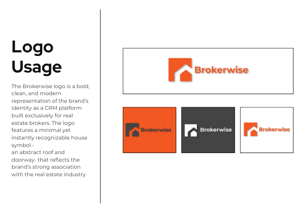
The Brokerwise logo is a bold, clean, and modern representation of the brand’s identity as a CRM platform built exclusively for real estate brokers. The logo features a minimal yet instantly recognizable house symbol—an abstract roof and doorway—that reflects the brand’s strong association with the real estate industry.
Client
Website
Design Elements & Symbolism:
• The house icon is constructed using geometric shapes that communicate structure, organization, and reliability—core elements of what Brokerwise offers through its CRM.
• The typography is a sleek, sans-serif font that embodies clarity, simplicity, and innovation—echoing the intuitive and user-friendly interface of the platform.
Color Palette Meaning:
• Orange symbolizes energy, optimism, and forward thinking—qualities that reflect Brokerwise’s commitment to modernizing the broker experience.
• Black and White are used for contrast and versatility, enhancing readability and lending a professional, trustworthy tone to the visual identity.
Brand Message:
The logo visually communicates efficiency, trust, and modernity, aligning perfectly with Brokerwise’s mission to empower brokers with a smart, seamless CRM solution. Whether used on web, mobile, or print, the logo’s clean form and adaptive color schemes ensure brand consistency across all platforms
Your email address will not be published. Required fields are marked *
